AN EXCLUSIVE INTERVIEW WITH JIM TSINGANOS
1ST PLACE WINNER . BY IDA SALAMON
Jim Tsinganos ©
All rights reserved.
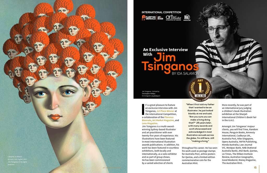
It’s a great pleasure to feature an exclusive interview with Jim Tsinganos, 1st Place Winner at the International Competition, a collaboration of the Florence Biennale, Art Market Magazine, and Lens Magazine.
Jim Tsinganos is a multi-award-winning Sydney-based illustrator and art practitioner with over twenty-five years of experience. His illustrations have been featured in most international illustration awards publications. In addition, his work has been featured in countless exhibitions, both locally and internationally, as a solo exhibitor and as part of group shows.
He has been commissioned by a varied selection of clients throughout his career. He has seen his work used as postage stamps for Australia Post, airline posters for Qantas, and a limited edition commemorative coin for the Australian Mint.
More recently, he was part of an international jury judging a children’s book illustration exhibition at the Sharjah International Children’s Book Fair
in the U.A.E.
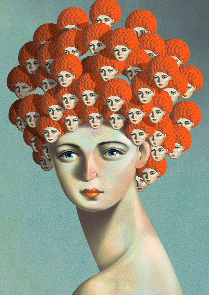
65 x 46.2 cm. Digital. 2017.
Jim Tsinganos © All rights reserved.
Amongst Jim Tsinganos’ majour clients, you will find Time, Random House, Penguin Books, Amnesty International, Cadburys UK., Australia Post, Nike Singapore, Opera Australia, YAFFA Publishing, Honda Australia, Law Journal VIC, Westpac Bank, NAB (National Australia Bank), ANZ Bank, Qantas, LA Times, The Milken Institute Review, Australian Geographic, Good Weekend, Money Magazine, The Australian Mint.
In the past few years, Tsinganos was awarded internationally, including the Society of Illustrators LA, Lurzer’s Archive Top 200 Illustrators Worldwide, Best Illustration – MADC Awards, Silver Award – NY Art Directors Club, Silver Award London Art Directors Club, Bronze Award – Print Regional Design/Illustration, Gold and Bronze Awards – Illustrators Australia Annual Illustration Awards.
“When I first told my father that I wanted to be an illustrator, he just looked blankly at me and said,
“Are you sure you can make a living doing that?” 25 years later, with many awards and work showcased and acknowledged in most illustration annuals across the globe, I’m still here, still “making a living.”
– Jim Tsinganos
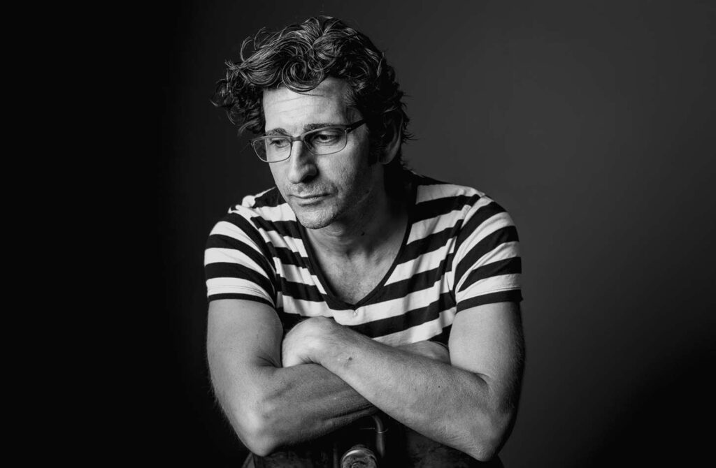
On Instagram: @cphillips77

50 x 43.36 cm. Digital. 2017
Jim Tsinganos © All rights reserved.
Art Market Magazine: Congratulations, Jim, for being chosen as the 1st place winner of the Contemporary Art and Fine Art Photography’s international competition, a collaboration of the Florence Biennale, Art Market Magazine, and Lens Magazine. Let’s start at the beginning. You were awarded many international awards, and your highly sophisticated, beautiful illustrations were published in many publications worldwide. Recently, you also served on the Jury Panel of the children’s book illustration exhibition at the Sharjah International Children’s Book Fair in the UAE. Please tell our readers what your background in Art is? Did you come from an artistic family? What drew you to the art field and to illustrations in particular?
Jim Tsinganos: Neither of my parents were artistic, so to speak, but my Grandfather on my father’s side was the local tailor of his village in Greece, which I guess can be classified as artistic.
I was raised as Greek Orthodox and would be captivated by the Byzantine Icons in the church. They must have had a big impact on me because I still love them and can see elements of their influence in my work today.
I drew all the time, and there was a group of us boys that would draw huge, intricate battle scenes, with planes, tanks, and jeeps, etc., and we’d make all the noises of explosions and gunfire as we drew. It must have been annoying to everyone else!
I remember around the age of seven or eight, my father would proudly announce to any house guests we had that “my son can draw.” At which point, I would be placed in front of one of them at the kitchen table and proceed to draw their portrait using a Bic biro, usually in blue or black, or in red if I was feeling adventurous. I remember putting a lot of effort and detail into the hair, drawing almost every strand. I knew I wanted to do something with my drawing talent because I couldn’t really do anything else. In high school, my careers counselor directed me towards an illustration course that was run in Adelaide at SACAE Underdale campus (UniSA). I didn’t know what Illustration was, but if it meant it had anything to do with drawing, I knew that’s what I wanted to do. I applied for both the fine art and the design course, which had a specialty illustration component. I didn’t get into fine Art because I think I “choked” in the practical entry exam. I got into design, majoring in Illustration, and I was immediately hooked.
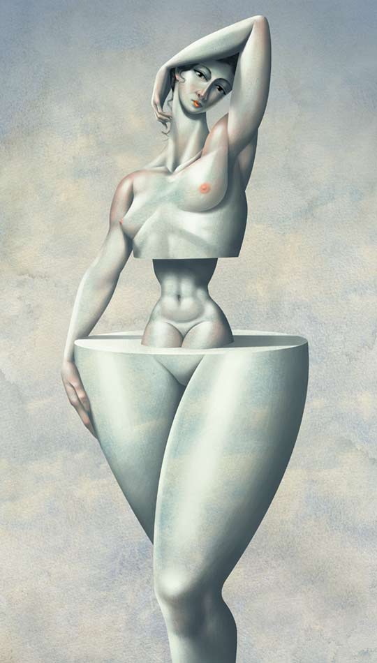
Jim Tsinganos © All rights reserved.
A. M.: Your work can be found on the cover of many books, postage stamps for Australia Post, airline posters for Qantas, and a limited edition commemorative coin for the Australian Mint. What was your path from being an anonymous artist to a leading illustrator artist? Tell us about your journey in the field, how it all started?
J. T.: This flows on from the first question a little. It all really began when I started at UniSA (University of South Australia). There are events in one’s life that are’ life-changing,’ like meeting your soul-mate, a life-long friend, your wife, the birth of your children, etc.
Going to UniSA was one of those life-changing events for me for two reasons. Firstly, on the first day, within the first hour, I met Stuart McLachlan, who is now a world-renowned artist and illustrator himself. We bonded instantly, like brothers, and were inseparable. We have buoyed, inspired, supported, and creatively pushed each other to this day and laughed like banshees along the way, and he was even the best man at my wedding. We still work together closely every day and bounce ideas and brainstorm regularly.
The second reason was that two years into the course when we began specializing in the illustration component, we had the good fortune to come under the tutelage of two amazing illustration lecturers, Keith McKewen and Michael Golding. Both had just arrived from England to take up the lecturing positions at the university.
They were both renowned illustrators who were still working in the field. So we got to see firsthand the real illustrative process as they would often bring their projects to the class. This was an invaluable experience for us.
They imbued us with their love and passion for Illustration and a high work ethic that has remained with both Stuart and me to this day. We often cite them as the most significant single influence on the trajectory of our careers and are forever thankful and indebted to them. They had both worked and lived in Amsterdam, so it was also because of them that Stuart and I decided to travel there. To work, live, experience, and expand our creative minds. This leads further to the development of our careers and the path that we are on now.

Jim Tsinganos © All rights reserved.
A. M.: On your website, we can see several styles, from Black and White sketches, illustrations in a cubism – surrealism influence (Artistic style of the 1930s- 1940s), and more modern, contemporary soft, and colorful, fluent illustrations. How would you describe your main artistic style?
J. T.: I guess I have a strong surrealist influence in my work. It draws heavily from concept, and in both my illustrative and art practice, it is the development and application of the idea that I enjoy the most.
Although sometimes, it’s nice to paint a vase, simply because it’s a nice vase.
A. M.: Do you have an artist or artistic style that influenced your work?
J. T.: I have many varied artists and artistic influences. From the fine art world, I am drawn to Chagall, Modigliani, Picasso, Tooker, Georgia O’Keeffe, Magritte, Hopper, Mapplethorpe, Klimt, Schiele, and Freud (Lucien). From the illustration perspective, Communication Art Illustration annuals were like bibles to us, so illustrators like Brad Holland, Anita Kunz, Gary Kelley, Ralph Steadman, Gerald Scarfe, Guy Billout, and Edward Sorel were like my gods. As well as some who straddled both fields like Cassandre, De Lempicka, Henri de Toulouse-Lautrec, and M.C. Escher.
I was also heavily influenced for a while by the polish poster artists, people like Stasys Eidrigevičius and Wiktor Sadowski, who produced such wonderful and potent conceptual work.
A. M.: You have such a great talent and fantastic imagination. Let’s talk about the creation process. Where do the ideas come from? Your work is full of a philosophical approach. Can you explain the messages behind your creativity?
J. T.: The ideas come from many sources, virtually anywhere. I read as much as I can, mainly fiction, as I find it transformative and a great visual generation source. I also have a voracious love and appreciation for film.
I particularly gained a lot of inspiration from music film clips. I keep sketchbooks, not only as drawing exercises but also for cataloging and recording ideas and concepts. If, for instance, I have a commission for an editorial illustration, I work up serval ideas for the pencil stage. Only one, however, will be used. I keep and reference the others in the sketchbook that act a bit like a library of ideas that I often use for other jobs. Sometimes amending them or combining several to form a new concept. I am like a sponge. I try to store all visual stimuli into my mental library for later use and reference. It’s as if I am a camera walking through the world, taking snapshots with my eyes of things that resonate with me.
For Example, the shape of a cloud formation, how the last ray of the setting sun captures the tops of trees, the shadow on a wall… I’ve always done this and felt this way; even when I’m not physically working, I’m working on remembering and recording.
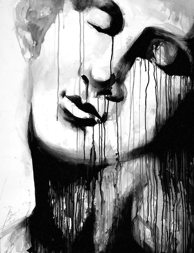
100 x 76.5 cm. Ink on Paper. 2001.
Jim Tsinganos © All rights reserved.
A. M.: Are you usually using pastels for creating your work? Did you ever work with other materials as well?
J. T.: For the past twelve years, I have predominantly worked digitally, creating all my work in Photoshop (Adobe), using a stylus and a tablet. I always do the initial sketches and conceptualize by hand and then scan them to begin coloring. Earlier in my career, I worked with pen and ink, watercolor, some oil paints, and then for the majority of my career, I was using pastels on prepared water-colored backgrounds. I worked hard at emulating this technique when I converted it to working digitally. I have created a bank of prepared water-colored backgrounds that I work on top of with the photoshop brushes. The exciting part was that my clients couldn’t tell the difference. Going digitally was actually a healthier option for me as the pastels produced an excessive amount of dust. I also love the combination of found objects with traditional painting and digital media. I like to push the digital boundary. I have incorporated leaves, anything washed up from the beach like wood, rubber, shells. I once even incorporated a dried desiccated lizard that a friend’s cat had brought in after catching it in the garden. I used it as if it was a whip in the Illustration.
A. M.: Can you describe the creating process step by step, from the idea to the final outcome?
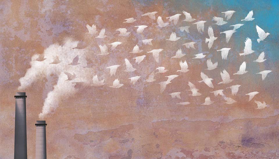
J. T.: I always start with a pencil, even if it’s only really rough, like a thumbnail size. I usually do many pencils and amendments to the pencils, particularly if it’s for a personal project, and I’m still trying to determine where I’m going with it. When I’m happy with it, I scan it and begin coloring it in photoshop. For instance, the piece ‘E Pluribus Unum’ was inspired by an Escher piece called ‘Rind,’ which was shown to me when I was in primary school at the age of seven. It’s of a woman’s face in profile made out of flowing ribbon, floating in
a cloud-covered sky. I was captivated by the simple, eloquent beauty of this image.
I had also taken note of and been fascinated by swarming, balling formations of Swallows that keep moving and changing shape in the sky, and I had made a mental note of it. There goes that internal camera of mine again. Bird motifs had always featured heavily in my work.
I had just finished a couple of other pieces that had birds in flight, so I had the idea of combining all those elements with that image of Eschers’ Rind’. I wanted to create an image about our interconnectedness to the world, each other, and our memories, captured in what seems a timeless eternity but is actually a fleeting instance gone almost before it’s begun.
A. M.: In your opinion, and from your enormous experience as an illustrator in the field, what place does the illustration field have in the contemporary art market (In auctions, exhibitions, and art fairs)?
J. T.: Where I studied in Adelaide in the ’80s, Illustration was always perceived as the lesser, poorer cousin to the fine art field. There was a sense of it not being as worthy. I never felt this way. As I mentioned in my influences, many of those artists straddle both fields quite comfortably. Lately, those perceived lines have become blurred with more cross-over and less austerity. Certainly, with the even more recent development of the NFT market adding validity and worth to digital art the lines are blurred even further. I expect to see more varied representations of visual mark-making at auctions, exhibitions, and art fairs as a result. After all, mark-making is mark-making, no matter its label.
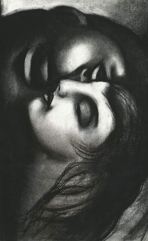
Jim Tsinganos © All rights reserved.
A. M.: What advice can you give to the young illustrators trying to succeed in the field today?
J. T.: I remember what my professors taught me: I’d say, be passionate, be tenacious and be prepared to work endlessly. Be true to yourself always, and above all, believe in yourself. Passion will drive you no matter what; even when you are floundering, passion will see you through. Just keep working and stick at it. There’s no underestimating being tenacious. I have met and seen many supremely talented artists and illustrators fall by the wayside because they stopped, gave up, or changed vocation. It’s a bit like a visual equivalent of a barroom brawl: the last one standing wins.
A. M.: Are you mainly working in Australia, where you were born? Do you have professional connections outside of the continent?
J. T.: I am based in Sydney and have been here for over twenty years. I spent several years in Amsterdam early in my career honing my skills. I am represented in the USA, UK, and Europe and receive regular commissions from them. I also have direct requests from clients from my website and social media. A lot has changed in the past twenty-five years since I started.
A. M.: On the upcoming event of XIII Florence Biennale, which will be held from 23 to 31 October 2021 at Fortezza da Basso in Florence, Italy, under the high patronage of the European Parliament, your art will be presented in a mass media campaign. How does this enormous exposure make you feel?
J. T.: I am completely thrilled. It’s such an honor, to say the least. I feel excited, and to be honest, I am still in disbelief. To be recognized and featured to this extent in a city as beautiful as Florence, the city of Michaelangelo’s David, is like a dream come true. I am still pinching myself. Not bad for a kid from Port Pirie that entertained his dad’s guest by drawing portraits of them in Bic biro.
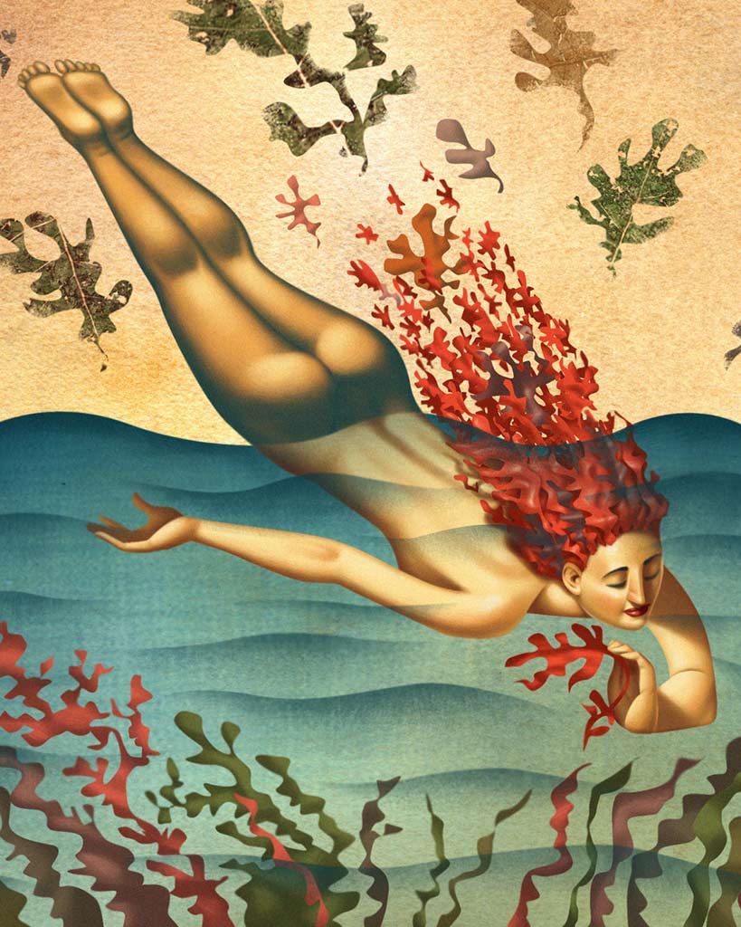
Jim Tsinganos © All rights reserved.

