ROUNDABOUT STUDIO: ART AND ARCHITECTURE IN SYMBIOSIS
By Kim Atherfold
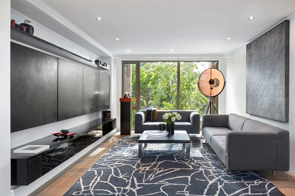
A stunning architecturally designed home in Yorkville, Toronto, pays homage to an impressive art collection.
By way of introduction, Yorkville’s ‘artistic’ history as it played out in the 1960s and 1970s precedes it in 2021 as a continuum, with ‘counter-culture’ at one end and gentrification at the other. At that time, the area was characterized by burgeoning music, literary and visual arts scenes.
During the decade from c1960 to c1970, disaffected youth from Toronto predominantly and the wider region flocked to Yorkville seeking selfhood and an inclusive collective mindset: graphically disowning the stultifying restrictions the dominant ‘conservative’ culture placed upon them. In Yorkville, they found a powerful sense of identity and place where experimentation and alternative lifestyles were the norms.
By 1964 every young Torontonian (and many young Canadians) likely knew that social rebellion and Yorkville went together as fingers interlaced. Yorkville was special: two seminal films investigated the countercultural and hippie movements, Flowers on a One Way Street 1968 & Christopher’s Movie Matinee 1968, both under The National Film Board of Canada’s auspices.
More recently, Artcetera: Narrativising Gentrification in Yorkville, Toronto, Vanessa Mathews discusses the extremes of Yorkville’s character. While Yorkville’s experience might be more pronounced, similar circumstances can be found the world over; London’s Hackney and Newham, Melbourne’s Fitzroy and Collingwood, and Auckland’s Ponsonby are prime examples.
Inferentially, a capsule of that legacy lives on in Yorkville Condo by recourse to the timbre of the collection it houses. It is alluded to at once obliquely, serendipitously, and ironically in the following description of a work found in the Condo’s Master bedroom: Rachel Whiteread represents an inverted bookshelf that’s symbolic of forgotten history and memory.
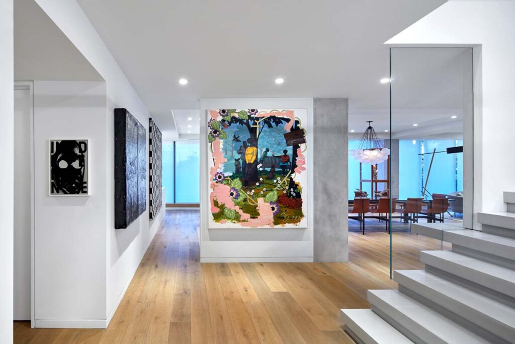
Within the architectural discipline, the role architecture plays in establishing an ‘a sense of place’ (failures and successes) is an issue routinely discussed in the media, especially in the last decade.
It would be easy for the uninitiated to overlook that aspect here when art is so obviously the star performer. Yet, the architecture does, in fact, strongly define a unique sense of place. It is inherent in the mellifluous connection to both the inhabitants and their role in the design process – the circumstances overlayed with the exigencies of the collection itself: the two disciplines working together as fingers interlaced’.
This collection foregrounds in this way due to the architectural spaces, their intricacies, and characteristics.
Although the condo living areas are relatively compact, careful space definition and distribution means it is divided into alternating lush and more or less spartan environments in a natural progression. Each zone has a distinct personality by dint of the architecture alone and is enriched specifically by the works’ placement.
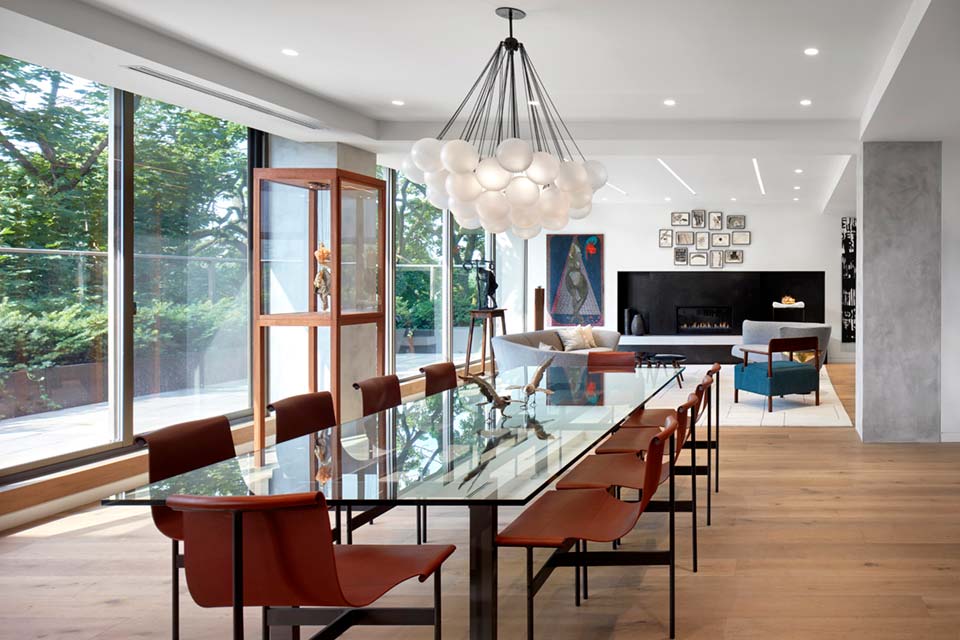
Despite the minimal palette and forms, a feeling of homeliness is derived simply from the mix of quality materials: tumbled French oak floors, timber stools, rich yet few individual furnishings, and a distinct connection to the outdoors. Neutral flooring and a ‘sliding grey palette’ add visual warmth and a faint pattern.
Additionally and subliminally, the history of Yorkville hovers knowingly in the background, the grandparent to the child contributing to the distinctiveness of place.
While the Schwartz have brought their own personalities to the interiors in ways beyond the collection itself, they have also consciously bought into the history of Yorkville by dint of their avant-garde collection on the one hand and their decision to live in Yorkville on the other.
Given the quote below refers to cities, it equally applies here. This sense of returning to the place frequently and having that deep connection with the place makes the ‘space’ become a ‘place’ of meaning and connection.
Moreover, the ‘meaning’ does not remain static; it is by definition flexible in accord with lifestyle and changing circumstances and is dictated by and imbued with both spontaneous and cultivated realizations.
While it is clear the internal design was driven by accommodating Alan and Alison Schwartz’s significant art collection in a ‘curatorial manner,’ the relationship between the two disciplines is one of symbiosis. That is, the collection displays seamlessly by dint of a congruent architectural response. Ironically, there is an impression of flexible, expansive wall space which, on closer inspection, is strategically finite: on the ground floor at least.
The design details not only support considered curation but enable solitary works to animate cryptically in particular circumstances, depending on their position. The neutral wall space (in turn both restrictive and elastic) makes this goal eminently possible.
Words like dynamic and strident might spring to mind as arbiters of the atmosphere initially; the mood, in fact, is more subtle. It is rich and enveloping yet not prohibitive. Not unlike a predominantly smooth flowing river interrupted by the odd tributary, which disrupts the hitherto uncomplicated flow.
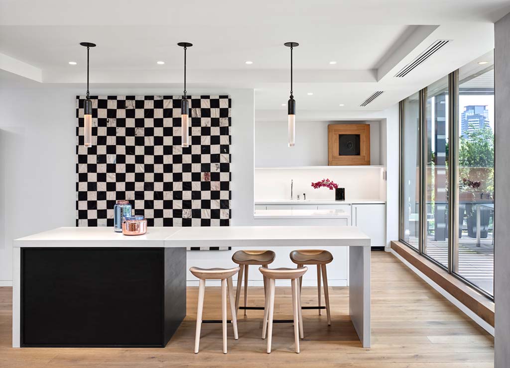
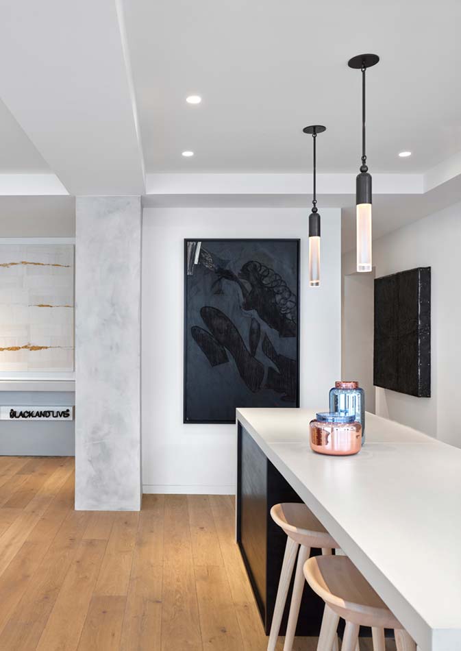
This Image provides an expression of viewing points within an architectural context. The view into the kitchen focuses the chandelier in relief, as a ‘soft’ rounded object, against a visually bold chequerboard work by artist Oscar Murillo in the background: hence lustrous and gentle contiguous with spirited and compelling.
Moreover, as the viewer approaches the chequered work, it reveals an aesthetic and textural softness not discernible from a distance: a surprising element in keeping with the timber-framed work in the kitchen proper.
This, along with the work parallel to the Murillo, represents a coup by the design team because it reveals revolving positive and negative spaces sequentially striking and delicate.
The ‘active’ position provides a conspicuous counterpoint to the ’empty space’, which occurs by recourse to white layering and is articulated by the equally arresting ‘lone pendant.’
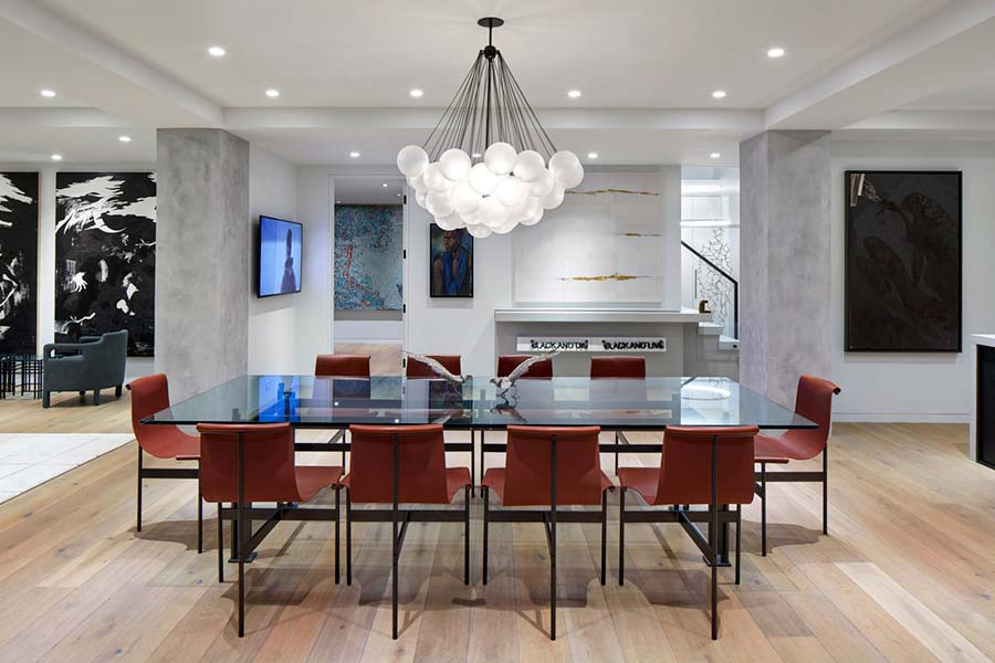
For us, how they approached their collection was one of the defining characteristics of this project. From sightlines to space planning, the eye is consistently led back to where it should be — the art.
The demarcation of space (physical) and art (which encompasses united physical, conceptual and psychological aspects) is organized so that both are appreciated in a chorus, which makes the experience of daily habitation richer, perpetually enticing, and always surprising. And Yet, the condo also had to feel comfortable and homelike—a place to unwind after a hectic day.
The kitchen and dining areas are ideal spaces to make a point about the way in which architecture and art inform each other positively. The ambiance is one of subtly adventurous yet original sophistication.
As a corollary, many of the represented artists such as Sigmar Polke, Chris Olfili, Zanele Muholi (for one reason or another) represent the vanguard of their respective diachronic positioning within the art world.
THE WALL IS AS IMPORTANT AS THE WORK.
Christie’s Marc-Olivier Wahler emphasizes the importance of wall space when hanging art. The presence of the windows and doors, the ceiling’s height, the quality of the floor, the electrical plugs and switches, etc. — all impact the way the spectator will interact with the works.
‘Negative space is, to me, one of the most unevaluated elements when it comes to placing several artworks together,’ comments Wahler. ‘What is the space in between each work? Throughout, negative and positive space is enfolded within a lyrical sequence of horizontals and verticals. These geometric components are balanced within a collaborative ‘one-off’ architectural and installation language. Additionally, material textures punctuate and project alternately according to the pendant light, timber-framed work, and stools – these aspects communicate specifically and harmoniously.
The same can be said of the view in the opposite direction: this perspective conveys a distinct personality – the intervening space is warm, understated, and variously textured, coaching the viewer to a more mellow, relaxed frame of mind. The ‘bubble chandelier above the dining table implies animated, witty, and continuous (yet discrete) conversations. It also implies the bubbles of champagne which undoubtedly flow around this table, on the topic of art in all its manifestations.
The living room projects as a floating oasis of delicate urbanity. At once sedate and warm whilst gently avant-garde in the spirit of the art collection. Notwithstanding a melodious milieu, multiple subtle contrasts and contexts are set up that work seamlessly with the architecture. Accordingly, Roundabout Studio was called upon to create…a trio of highly custom resin and walnut coffee tables in teal and smoke specifically for the formal living room. A compositional counter to the geometric line and rectangular forms in the rug, the lamp, and artwork.
Indirectly, the linear connections detailing the rug mirror both a mindset of endless inquiries and the simple geometries the architects employed to house the collection.
The placement of the artworks says a lot about the inhabitants. For example, consider the dynamic work in the kitchen as well as that at the foot of the stairs – they are powerful defining pieces that compel viewing.
The restrictive hanging space contributes to their force as objects of contemplation. Whether consciously or not, the positioning reveals a little of the inhabitant’s character – hanging of this kind speaks to collectors who value not only their art but the domestic dialogue it generates.
At first glance, the stairwell appears uncomplicated, yet it too is an object to reflect upon – an ingenious design that imparts subtle charisma and theatrics.
Daniel Harland from Roundabout Studio mentioned:
“We wanted it to be modern and contemporary but not flashy. A place that had a quiet, almost Zen-like feeling.”

